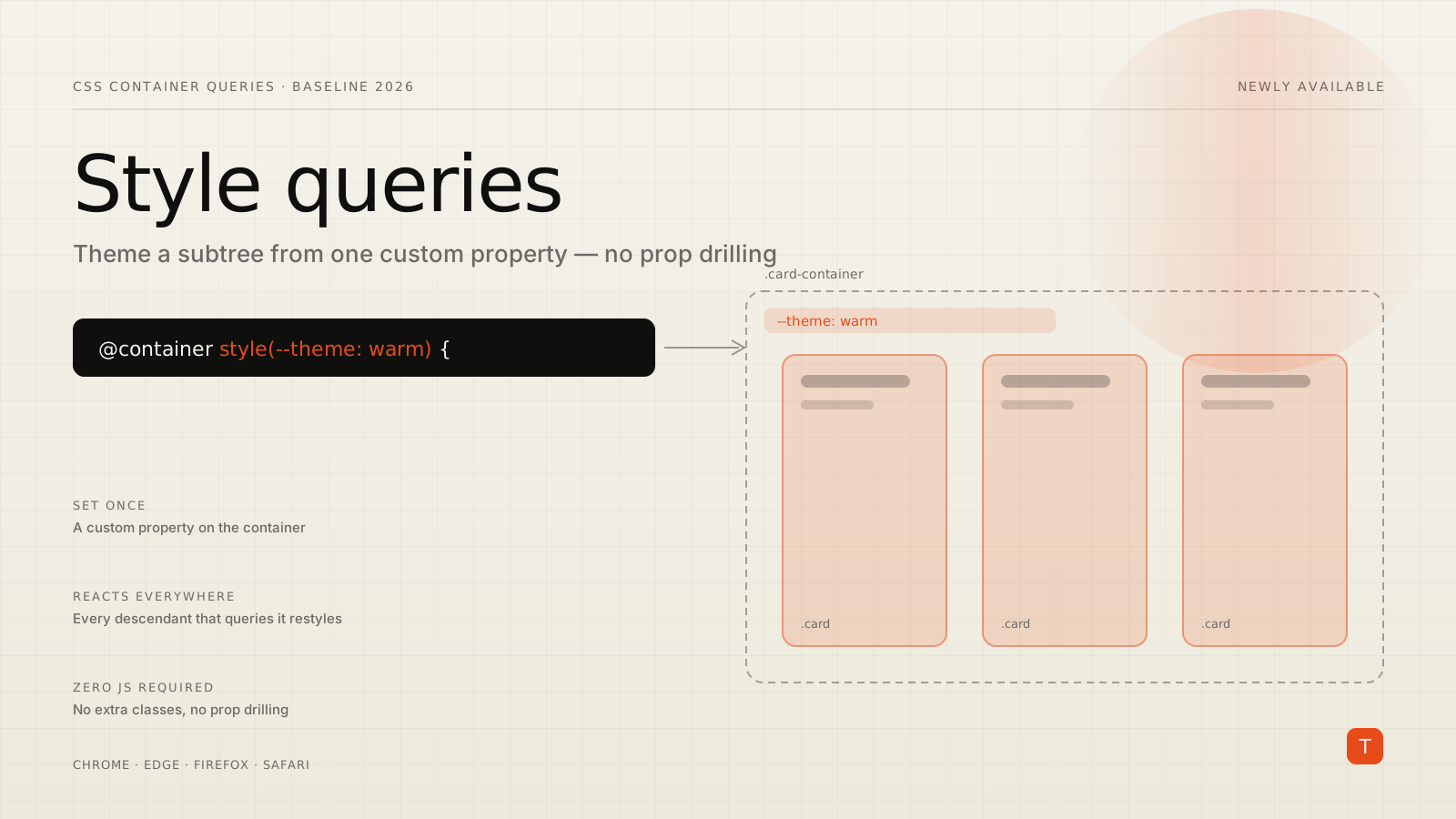
Container queries arrived in two halves. The size half — restyling a component based on the width of its container instead of the viewport — landed first and got all the attention. The style half sat behind it, shipping in Chrome 111 back in 2023 but waiting on the rest of the browsers. That wait is now over. In the May 2026 Baseline digest, published June 3, the Chrome team confirmed that container style queries are Baseline Newly available — supported in the current stable versions of Chrome, Edge, Firefox, and Safari.
If you have ever passed a variant prop down four component layers just so a button could turn red inside a "danger" card, this is the feature that deletes that plumbing. Here is what style queries actually do, the exact syntax, and the patterns worth adopting now that they work everywhere.
What a style query is
A container size query asks "how wide is my container?" A container style query asks "what is the computed value of a custom property on my container?" When the answer matches, the rule applies. In the current rollout the thing you can query is CSS custom properties — --theme, --density, --status, whatever you define — which turns out to be exactly the lever component authors want.
The syntax wraps the condition in a style() function:
/* Style .card based on the value of --theme on its container */
@container style(--theme: warm) {
  .card {
    background-color: wheat;
    border-color: brown;
  }
}
The style() wrapper exists to disambiguate. A bare @container (min-width: 200px) is a size query, but min-width is also a real CSS property you might want to query the value of. Writing @container style(min-width: 200px) makes the intent explicit. For custom properties there is no ambiguity, but the wrapper is still required.
The mental model: data lives in a custom property somewhere up the tree, and design lives in style queries that react to it. You set --theme once, in one place, and every descendant component knows how to respond. That is the "separation of data from design" the Chrome style queries guide keeps emphasizing, and it is more than a slogan once you build with it.
Querying a direct parent
Style queries have a usability quirk that size queries do not: for a direct parent, you do not need to declare container-type or container at all. You only need the custom property to live on an element that contains the one you are styling.
Given this markup:
<ul class="card-list">
  <li class="card-container" style="--theme: warm">
    <div class="card">…</div>
  </li>
</ul>
This rule just works:
@container style(--theme: warm) {
  .card {
    background-color: wheat;
  }
}
One rule that trips people up: you cannot query a custom property on the same element you are styling with that query. If .card both carries --theme and is targeted by the query, you would create a circular dependency, so the property has to live on a containing element — here, .card-container. Put the data on a wrapper, style the child. That constraint is by design, to prevent infinite loops.
Querying a non-direct ancestor
When the element holding the property is further up the tree — not the immediate parent — you give that ancestor a container-name and reference it in the query:
.card-list {
  container-name: cards;
}

/* Style .card based on a property set way up on .card-list */
@container cards style(--layout: compact) {
  .card {
    padding: 0.5rem;
  }
}
Naming containers is good practice regardless. It makes each query self-documenting about what it is reacting to, and it lets nested elements reach past their immediate parent to a known ancestor instead of relying on proximity.
A practical example: status-driven product cards
The canonical use case is a reusable component with several variants whose state is decided by data, often server-rendered. Picture a product grid where each card can be flagged "new" or "low stock," and low-stock cards get an alarming border. The state arrives as an inline custom property on each card's container:
<li class="card-container" style="--detail: low-stock">
  <div class="card">…</div>
</li>
@container style(--detail: new) {
  .comment-block {
    display: block;
    color: var(--color-info);
  }
}

@container style(--detail: low-stock) {
  .comment-block {
    display: block;
    color: var(--color-danger);
  }
  .card {
    border-color: var(--color-danger);
  }
}
The component's markup never changes between variants. There is no class="card card--low-stock" toggling, no conditional rendering branch — just a single data attribute expressed as a custom property, and CSS deciding what that means visually. Back-end and templating code stays focused on data; the design system owns the appearance.
You can also combine conditions with and, which is handy for compound states:
@container style(--sunny: true) and style(--cloudy: true) {
  .weather-card {
    background: linear-gradient(24deg, pink, violet);
  }
}
Driving themes from JavaScript
Because the input is a custom property, runtime theming is a one-liner. Anything that can call setProperty can re-skin an entire subtree:
themePicker.addEventListener('input', (e) => {
  cardParent.style.setProperty('--theme', e.target.value);
});
Set the property on a parent and every style query under it re-evaluates. No class bookkeeping across components, no passing the new theme through a context provider into each leaf. The DOM mutation is one property on one element; CSS fans the change out to the descendants that care. This is the cleanest theming primitive the platform has shipped, and it composes naturally with frameworks — set the property in your render and let CSS do the rest.
The one limitation to know
Style queries currently match a custom property against a value. There is no boolean "does this property exist at all" form yet. You might wish you could write @container style(--detail) to share styling for any card that has a --detail flag regardless of its value, and then layer value-specific rules on top. That presence syntax is still being discussed in the CSS Working Group and is not part of what shipped. For now, write one rule per value you care about, even if it means a little repetition.
The other thing to set expectations on: the spec allows querying arbitrary properties such as font-weight: 800, but the shipped implementation across browsers is scoped to custom properties. That covers the overwhelming majority of real component-theming needs, so it is a limitation in theory more than in practice.
Where this fits in your stack
Style queries are not a replacement for component props or design tokens — they are the missing link between them. Tokens define your values; props decide intent at the data layer; style queries let CSS translate that intent into appearance without every component needing to know the full theming contract. The payoff is concrete in three places:
Reusable components that ship with variants stop carrying variant-specific class logic. Server-rendered or CMS-driven UIs can express state as a single custom property and let the design system interpret it. And theming — light/dark, brand skins, density modes — collapses to setting one property on a container instead of threading state everywhere.
If you maintain a design system or a component library, this is worth a real look this quarter. Audit the places where you currently drill a variant or theme prop several layers deep, or toggle modifier classes to express state that is really just data. Many of those can become a custom property on a container plus a handful of style queries — less JavaScript, less markup coupling, and behavior that lives where it belongs. Now that it is Baseline across all four engines, you can adopt it without a fallback plan for the common case; reserve progressive enhancement only for the long tail of older browser versions your analytics still show. Open the State of CSS 2026 survey while you are at it — vendor roadmaps for features exactly like this one are shaped by what developers report using.
Sources: May 2026 Baseline monthly digest — web.dev · Getting Started with Style Queries — Chrome for Developers · Using container size and style queries — MDN