Every design system eventually accumulates the same quiet chore: for each background color, someone has to decide whether the text on top should be black or white, write it down, and keep the two in sync forever. Add a dark mode, a few brand accents, and a "let users pick their own theme color" feature, and that table of pairings grows into a maintenance liability that silently drifts out of WCAG compliance the first time someone tweaks a swatch.
CSS now has a native answer. As of April 2026, the contrast-color() function is Baseline Newly available — it works in the latest stable releases of Chrome, Firefox, and Safari, which shipped it as Chrome 147, Firefox 146, and Safari 26 (web.dev April 2026 Baseline digest). You give it a color, and the browser returns a contrasting one. The color pairing logic moves out of your stylesheet and into the engine.
What contrast-color() actually does
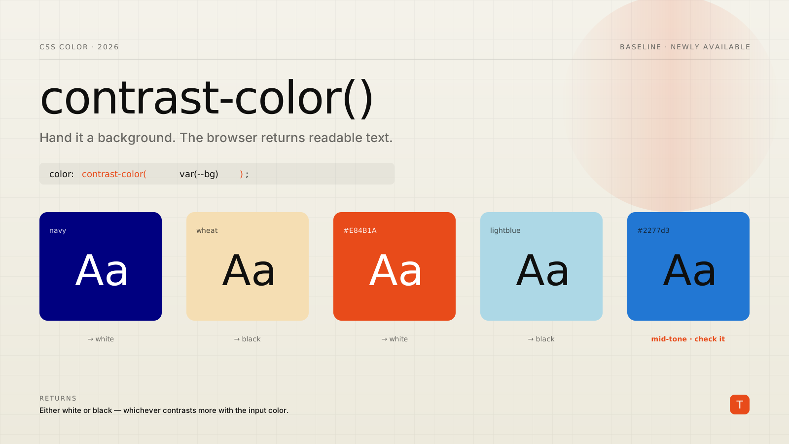
The function takes any valid <color> and returns either white or black — whichever has the greatest contrast against the input. If both are equal, it returns white (MDN reference). That is the whole contract. It is intentionally narrow: not a full palette generator, not a "darken this by 20%" utility, just a binary readability pick for foreground text.
The syntax is as plain as it sounds:
color: contrast-color(red);
color: contrast-color(var(--surface));
The canonical use is pairing a text color to a background you already have in a custom property:
.badge {
  background-color: var(--badge-color);
  /* Resolves to black or white, whichever reads better */
  color: contrast-color(var(--badge-color));
}
Before this, the same result meant either a JavaScript helper computing relative luminance at runtime, a Sass function baking the decision at build time, or a hand-written lookup table of --badge-color / --badge-text pairs. All three are now replaceable by one line that the browser keeps correct on its own.
Where it earns its keep: colors you don't know at build time
For a fixed brand palette, you could argue the old lookup table was fine — you only wrote it once. The real payoff is anywhere the color is not known when you write the CSS:
- A user-selected theme color from a settings page.
- A category or tag color pulled from a database and injected as a CSS variable.
- A white-label product where each tenant supplies their own brand color.
- Charts and data visualizations that assign colors programmatically.
In every one of those cases, the old approaches forced you to ship JavaScript that reads the chosen color, computes luminance, and writes back a text color. That is a render-blocking round trip and a class of bug — the JS and CSS disagreeing about state — that simply disappears. Set the variable, and contrast-color() resolves the text color in the same paint:
.tag {
  /* --tag-color is set inline from data, e.g. style="--tag-color:#1b9e77" */
  background-color: var(--tag-color);
  color: contrast-color(var(--tag-color));
  padding: 0.2em 0.6em;
  border-radius: 999px;
}
The dynamic-theming community has already started building "self-correcting" color systems on top of exactly this primitive, where the only thing you store is the source color and every readable pairing is derived (Smashing Magazine, May 2026).
Light and dark mode without a second color set
Because the function reacts to whatever value the variable resolves to, it composes cleanly with prefers-color-scheme. You swap one variable; the text color follows automatically:
:root {
  --background-color: wheat;
}

@media (prefers-color-scheme: dark) {
  :root {
    --background-color: navy;
  }
}

body {
  background-color: var(--background-color);
  color: contrast-color(var(--background-color));
}
One declaration for text color covers both schemes. There is no --text-light / --text-dark pair to define, and no risk of updating the background in one media query but forgetting the matching text color in the other.
The caveat that keeps this honest
contrast-color() is not a license to stop thinking about contrast. The function targets WCAG AA (4.5:1), and that threshold is not achievable against every background using only black or white. Mid-tone colors are the trap: a royal blue like #2277d3 will be paired with black text, which is not actually readable at small sizes (MDN). The function returns the better of two options, not a guaranteed-passing one — when both black and white fail, you still get whichever failed less.
The practical rule: use contrast-color() with backgrounds that live near the light or dark ends of the range, and treat your mid-tones as a design problem to solve, not something the function will rescue. If a tenant supplies a muddy mid-tone brand color, the right move is to darken or lighten the surface before contrasting against it — the function won't invent readability that the color can't support. WebKit's introduction to the feature makes the same point: it is a convenience for the common case, not a substitute for checking your palette (WebKit blog).
Shipping it safely with progressive enhancement
Baseline Newly available means the feature works in current browsers but a real slice of your traffic — especially on mobile, where update cycles lag — is still a version or two behind. So contrast-color() should be an enhancement layered over a sane default, never the only thing standing between your users and legible text.
Declare a reasonable fallback first, then gate the upgrade behind @supports:
.badge {
  background-color: var(--badge-color);
  color: #fff; /* safe default for older browsers */
}

@supports (color: contrast-color(red)) {
  .badge {
    color: contrast-color(var(--badge-color));
  }
}
Browsers that understand contrast-color() apply the smart value; everything else keeps the static fallback. Because CSS ignores declarations it cannot parse, even without the @supports guard an old browser would just drop the contrast-color() line — but pairing it with an explicit fallback declaration is what makes the degradation predictable instead of accidental.
For surfaces where you genuinely cannot predict the color, keep the fallback conservative. White text on an unknown background is a coin flip; if you must pick one, choose the value that is correct for the majority of colors you actually expect to receive, and let contrast-color() fix the rest where it is supported.
Why this matters beyond the stylesheet
For teams shipping client software, the interesting part is not the syntax — it is what it removes from the codebase. Accessible color contrast is a requirement, not a nicety: it shows up in procurement checklists, accessibility audits, and increasingly in contractual obligations for products sold into regulated industries and the public sector. The old way of meeting it — runtime luminance math, hand-curated pairing tables, theme JSON that has to stay in lockstep with the CSS — is exactly the kind of bespoke, fragile machinery that breaks quietly and fails an audit months later.
Moving that logic into a Baseline platform feature means one fewer custom system to test, document, and hand off. The web.dev team framed the broader trend well this spring: leaning on standardized platform features, rather than reinventing accessible patterns in JavaScript, is what makes building accessibly sustainable (web.dev). contrast-color() is a small but concrete instance of that — a maintenance burden you can hand back to the browser.
Takeaways
contrast-color() is a narrow function with a wide cleanup radius. It replaces lookup tables, build-time color helpers, and runtime luminance scripts with a single declaration the browser keeps correct.
Three steps if you are adopting it this quarter. First, find every place your theme stores a --something-color next to a manually chosen --something-text and collapse the second into contrast-color(). Second, wrap dynamic, user- or data-supplied colors in it so you can delete the JavaScript that currently computes text colors at runtime. Third, audit your mid-tone backgrounds separately — the function will not make an unreadable surface readable, so those still need a real design decision. Ship it behind an @supports guard with a static fallback, and the downside is bounded: where it lands you get automatically accessible text, and where it doesn't you get the same UI you had before.