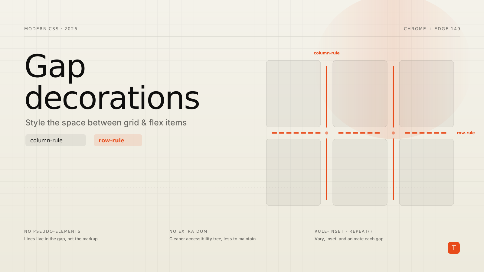
Drawing a line between two columns of a layout should be trivial. In practice it has always been one of those tasks that quietly leaks complexity into a codebase. You want a hairline separator between the items in a grid or a flex row, and CSS gives you no direct way to style the gap — so you reach for a border on each item, a pseudo-element, a background gradient hack, or an extra <div>. Each of those works until the layout wraps, an item is removed, or a designer asks for the line to stop short of the corners.
That gap is now a first-class styling surface. In Chrome and Edge 149, CSS gap decorations shipped to stable — a feature built jointly by the Microsoft Edge and Google Chrome teams. It extends the familiar column-rule property to grid and flexbox and adds a matching row-rule, so you can paint lines into the space between layout items with pure CSS and nothing in the markup.
What actually shipped
Multi-column layouts have had column-rule for years: set a width, style, and color, and the browser draws a line in each column gap. Grid and flexbox never got the equivalent, which is why gap styling has been a workaround factory. Chrome and Edge 149 fix that in two moves. First, column-rule now applies to grid and flex containers, not just multicol. Second, there's a new row-rule property for the horizontal gaps that multicol never had.
Both accept the same shorthand you already know, and there's a combined rule shorthand to set both axes at once:
.grid {
  display: grid;
  grid-template-columns: repeat(3, 1fr);
  gap: 24px;
  column-rule: 1px solid #5a9e9e;
  row-rule: 1px solid #c27a6b;
}
These decorations are purely visual. They paint inside the existing gap and don't change the size or position of anything, so you can add and remove them without touching your layout math. Critically, they don't add DOM nodes — which means no phantom entries in the accessibility tree, and none of the maintenance drift that comes from separator markup that has to be kept in sync with the content.
Varying decorations across gaps
A single line style everywhere is the easy case. The more interesting part is that the width, style, and color longhands each accept a comma-separated list that maps onto successive gaps. Here's a flex container whose column rules alternate between dashed and solid:
.flex-split {
  display: flex;
  gap: 32px;
  column-rule-width: 2px;
  column-rule-style: dashed, solid;
  column-rule-color: #d4d0c8;
}
When there are more gaps than listed values, the list cycles. For repetitive patterns there's a repeat() syntax, mirroring the repeat() you already use for grid track definitions:
.settings-panel {
  row-rule: 1px solid #243352;
  row-rule-width: repeat(2, 1px), 4px;
}
That gives the first two row gaps a 1px rule and the third a 4px rule, then cycles. It's the kind of thing that used to require :nth-child selectors targeting specific items — now it's a property on the container that survives reordering and responsive reflow.
Controlling what happens at intersections
In a grid, row and column rules cross. How they meet is configurable through column-rule-break and row-rule-break (with a rule-break shorthand). The default is normal; none runs the decorations continuously through every intersection; and intersection breaks each rule where the crossing gap passes through.
.dashboard {
  column-rule-style: solid;
  column-rule-color: #fbbf24, #34d399;
  column-rule-width: 1px, 3px;
  column-rule-break: intersection;
  row-rule: 1px solid #1e1e36;
}
This is a small detail with an outsized effect on how a layout reads. Continuous rules produce a ledger-grid feel; broken rules give you tidy, disconnected separators that don't visually box in each cell.
Insets: lines that don't run edge to edge
Often you don't want a separator touching the container's outer edges or crashing into the corners of an intersection. The column-rule-inset and row-rule-inset properties — plus the rule-inset shorthand — pull the decoration inward. A single length shrinks the line on all sides:
.container {
  display: flex;
  flex-wrap: wrap;
  gap: 20px;
  column-rule: 1px solid #2a2a45;
  row-rule: 1px solid #2a2a45;
  rule-inset: 5px;
}
For finer control, rule-inset-cap targets the endpoints that terminate at the container edge, while rule-inset-junction targets the endpoints that meet a crossing gap. Setting the cap to zero and the junction to a positive value gives lines that are flush with the container but pull back from intersections — and because insets are animatable, you can transition them on state changes:
.dashboard {
  rule-inset-cap: 0px;
  rule-inset-junction: 10px;
  transition: rule-inset-junction 0.4s;
}
.dashboard:hover {
  rule-inset-junction: 0px;
}
Inset values can also be percentages or the overlap-join keyword, which joins adjacent decorations neatly into corners.
Showing rules only where they belong
By default, whether a rule appears in a given gap depends on the container type. When you want explicit control — especially with flex-wrap or sparse grids where some gaps sit next to empty space — reach for column-rule-visibility-items and row-rule-visibility-items (shorthand rule-visibility-items). The useful values are between (draw a rule only where two items sit on either side of the gap) and all (draw a rule in every gap, including empty ones):
section {
  display: grid;
  grid-template-columns: repeat(3, 1fr);
  gap: 24px;
  rule: 2px solid #1e1e36;
  rule-visibility-items: between;
}
between is what you want for editorial and card layouts, where a rule dangling next to a half-empty final row looks like a mistake. all is for calendar and dashboard grids where the grid itself is the design and every cell boundary should be drawn.
Animating the lines
Rule width, color, and insets are all animatable, so gap decorations participate in transitions like any other paintable property. The dashboard demo from the Chrome team shifts both rule color and junction inset on hover:
.dashboard {
  column-rule-color: #fbbf24, #34d399;
  rule-inset-junction: 10px;
  transition: column-rule-color 0.4s, rule-inset-junction 0.4s;
}
.dashboard:hover {
  column-rule-color: #3b82f6, #3b82f6;
  rule-inset-junction: 0px;
}
Because none of this touches layout geometry, these animations run without triggering reflow — they're paint-only, which is exactly the category of animation you want on interaction.
Browser support and shipping it safely
As of July 2026, gap decorations are in Chrome and Edge from version 149; the June web platform roundup still lists Firefox and Safari as not supporting them, so this is not yet a Baseline feature. That's fine, because the feature was designed for progressive enhancement. Decorations are purely visual, so a browser without support simply renders your gaps as empty space — the layout is identical, just without the lines. A polyfill is in development for teams that need the lines everywhere today.
For anything decorative, that means you can ship it now with no guard at all. If a separator is load-bearing for comprehension, gate the enhancement — and any fallback — behind feature detection so the two never both apply:
@supports (row-rule: 1px solid black) {
  .grid {
    column-rule: 1px solid #5a9e9e;
    row-rule: 1px solid #c27a6b;
  }
}
One migration note if you kicked the tires during the Chrome 139 developer trial: the property names changed to track the spec. column-rule-outset and row-rule-outset are now column-rule-inset and row-rule-inset, the visibility-items properties are new, and animation support was added. Code written against the trial names needs a quick update.
Takeaways
Gap decorations turn a recurring markup problem into a styling one. Audit your components for separator borders, divider pseudo-elements, and spacer <div>s that exist only to draw a line between grid or flex items — those are now deletion candidates. Replace them with column-rule and row-rule on the container, reach for the comma-list and repeat() syntax when decorations vary across gaps, and use rule-visibility-items: between to keep lines from dangling next to empty cells. Treat the whole thing as progressive enhancement: ship the CSS, let unsupported browsers fall back to plain gaps, and lean on @supports only when a separator is essential rather than ornamental. It's a rare feature that simultaneously removes DOM nodes, improves accessibility, and cuts maintenance — worth adopting the next time you touch a layout that draws its own lines.
Sources: Chrome for Developers: Gap decorations now available in Chromium · web.dev: New to the web platform in June · W3C CSS Gap Decorations Module Level 1