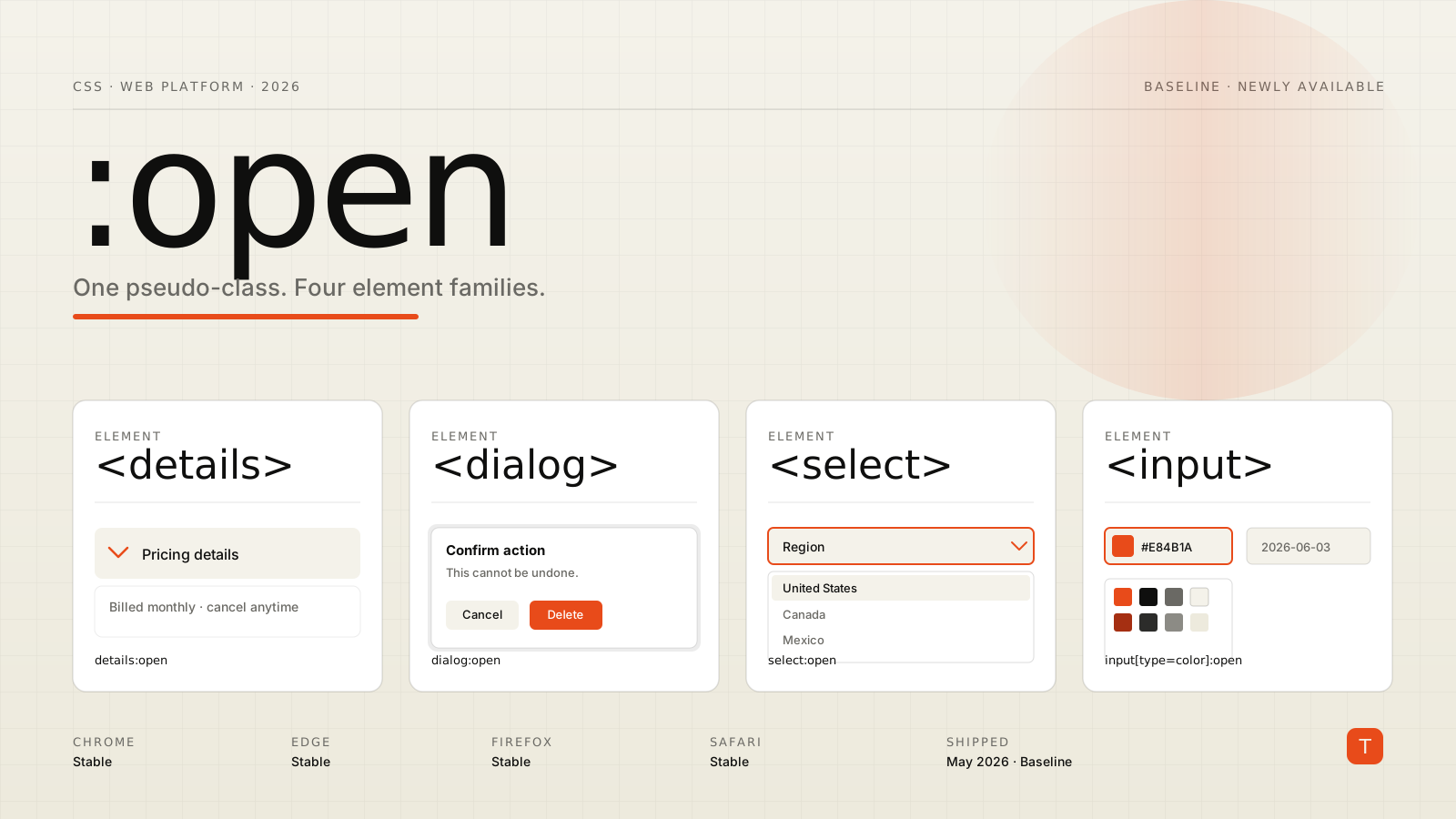
For years, styling "this element is currently open" meant a different selector for every element type: details[open] for disclosure widgets, dialog[open] (or :modal) for modals, and absolutely nothing reliable for the native picker on a <select> or an <input type="color">. That fragmented surface finally collapses into one selector. As of May 2026, the CSS :open pseudo-class is Baseline Newly available, meaning it works across the latest versions of Chrome, Edge, Firefox, and Safari (web.dev May 2026 roundup).
That is a small win on paper and a meaningful one in practice. :open is one of those rare CSS additions where the feature surface is tiny but it removes a whole category of "why do I need three rules for this?" code from a design system.
This post is a tour: what :open matches, what it intentionally does not, how it differs from :popover-open and :modal, and a few patterns where it actually pays off.
What :open matches
The MDN reference for :open is short and worth reading in full, but the gist is that :open targets elements that have an open/closed semantic state and are currently in the open state. Concretely, that is:
<details>while expanded (theopenattribute is present)<dialog>while shown viashow()orshowModal()<select>while its drop-down picker is displayed<input>types that surface a picker (color, date, file, datetime-local, month, week, time) while that picker is on screen
The last two are the new capability. Before :open, there was no way in CSS to say "the user has just opened the native color picker, give the swatch a focus ring." Now there is.
Two subtleties matter. First, :open is about semantic state, not visibility. A <dialog> styled display: none is still considered closed; the selector tracks the open attribute / state machine, not whether you can see the element. Second, :open does not match popovers opened via the Popover API — those have their own dedicated :popover-open pseudo-class. That separation is deliberate, because popover state can co-exist with open/closed state on the same element.
The shortest useful example
Disclosure widgets are the easiest place to start. The classic pattern was an attribute selector:
details[open] > summary {
  border-bottom: 1px solid var(--ink-15);
}
That still works and is fine. With :open you can write the same rule in a way that generalizes across element types:
:is(details, dialog):open > :first-child {
  border-bottom: 1px solid var(--ink-15);
}
You get a single rule that styles the first child of any open <details> or <dialog>. More importantly, you can now do things that the attribute selector cannot — for example, parent-style based on whether a <select> is currently dropped down.
Styling the open select
This is the example most people reach for first. A native <select> has historically been a black box: you can style the closed control, but the moment a user clicks it, the operating system takes over. With :open you can react to the open state of the control itself:
.field select {
  background-image: url("data:image/svg+xml,%3Csvg ... down-chevron%3C/svg%3E");
  background-repeat: no-repeat;
  background-position: right 0.5rem center;
  transition: background-color 120ms ease;
}

.field select:open {
  background-color: var(--paper-2);
  background-image: url("data:image/svg+xml,%3Csvg ... up-chevron%3C/svg%3E");
}
That second rule fires while the dropdown is on screen and rolls back the moment it closes. No JavaScript, no focus proxies that lie about state. The same pattern works for the color picker:
input[type="color"]:open {
  outline: 2px solid var(--accent);
  outline-offset: 2px;
}
CSS-Tricks has a similar example in its almanac entry; the takeaway is the same — you finally have a hook for "the picker is up."
:open vs :popover-open vs :modal
These three pseudo-classes look interchangeable from a distance and are not. A quick mental model:
:open— semantic open/closed state on<details>,<dialog>,<select>, and picker-style<input>s.:popover-open— any element with thepopoverattribute that is currently showing.:modal— any element in the top layer that blocks interaction with the rest of the page (notably<dialog>shown viashowModal()).
A <dialog> opened with showModal() matches all three of :open, :modal, and (if it has popover="auto" instead of being shown as a true modal) potentially :popover-open. The right selector depends on the question you are answering:
/* Any dialog that is showing, modal or not. */
dialog:open { ... }

/* Only modal dialogs — show a backdrop treatment. */
dialog:modal { ... }
dialog:modal::backdrop {
  background: rgb(15 15 14 / 0.45);
  backdrop-filter: blur(6px);
}

/* Tooltips and menus built on the Popover API. */
[popover]:popover-open { ... }
Picking the narrowest selector that expresses your intent keeps these rules from accidentally targeting the wrong thing the moment your component changes its open mechanism.
A parent-selector pattern with :has() and :open
The combination most design systems will actually reach for is :open plus :has(). The two together let you style an ancestor based on whether one of its descendants is currently open:
.card:has(details:open) {
  box-shadow: 0 12px 32px rgb(15 15 14 / 0.08);
  border-color: var(--ink-25);
}

.field:has(select:open) {
  z-index: 10; /* lift the field above its neighbors while the picker is up */
}
That second rule is the kind of thing that used to require a focus-within proxy or a JS toggle. With :open and :has() it is one selector, declaratively scoped to "while the picker is on screen."
Progressive enhancement and what to do in older browsers
:open is Baseline Newly available, not Baseline Widely available. That distinction matters: the feature works in the latest browser versions, but a meaningful share of real-world users will still be a release or two behind, especially on mobile. The right pattern is the one you would use for any other Newly available feature — treat the :open styling as an enhancement, not the load-bearing layer.
For <details> and <dialog>, fall back to the attribute selector, which has been supported for years:
details[open] > summary,
details:open > summary {
  border-bottom: 1px solid var(--ink-15);
}
For <select> and the picker inputs, there is no good legacy fallback — those simply don't get the enhanced styling on older browsers, and that is fine. The control still works; it just doesn't get the extra polish. As the Fully Stacked post on the same selector points out, this is the kind of feature where graceful degradation is essentially free, because the closed state is already a valid design.
You can also gate the rule with @supports selector(...) if you want to be explicit about it:
@supports selector(:open) {
  input[type="color"]:open {
    outline: 2px solid var(--accent);
    outline-offset: 2px;
  }
}
Where it pays off in production
Three patterns are immediately useful in a typical product UI:
- Form fields with native pickers. Outline the field while the color, date, or file picker is up so the user does not lose track of which input they opened. This is a small detail that disproportionately improves perceived polish on forms.
- Disclosure-driven layouts. When a
<details>opens inside a card, lift the card with:has(details:open)to draw the eye and shrink the apparent density of the surrounding list. - Dialogs with backdrop work. Combine
dialog:openanddialog:modal::backdropto keep the backdrop styling tied to the state machine rather than a separate.is-openclass your JavaScript has to remember to toggle.
None of these are new ideas. What is new is that they collapse into a couple of selectors instead of a JS-driven state class.
Takeaways
:open is a small selector with an outsized cleanup effect. It standardizes a hook that previously required an attribute selector, a JS class, or nothing at all, depending on which element you were styling. As of May 2026 it is Baseline across the four major engines, and the progressive enhancement story is uncomplicated: where it lands, you get a nicer interaction; where it doesn't, you get the same UI you had yesterday.
Three concrete steps for design systems shipping this quarter: replace details[open] with details:open (or :is(details, dialog):open) in your tokens layer, add :has(select:open) and input[type="color"]:open outlines as enhancements on form fields, and audit your dialog backdrops for any state classes you can retire in favor of dialog:open and dialog:modal::backdrop. The diff is small, the risk is low, and the result is one less inconsistency in your component library.