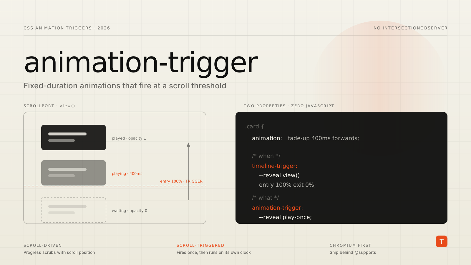
Almost every marketing site we build has the same requirement buried in the design: content should fade or slide into place as the visitor scrolls to it. For the last several years the answer has been the same — wire up an IntersectionObserver, toggle a class, and let CSS handle the rest. Or reach for a library and ship 40KB of animation runtime to do it.
Chrome has now shipped a declarative replacement. Scroll-triggered animations, built on the new timeline-trigger and animation-trigger properties, let you fire a normal, fixed-duration CSS animation when an element crosses a scroll threshold. No observer, no class toggling, no JavaScript at all.
It is worth being precise about what this is, because the naming collides with a feature that already exists.
Scroll-triggered is not scroll-driven
CSS scroll-driven animations shipped in Chrome back in 2023. They scrub: animation progress is bound to scroll progress, so the animation has no duration of its own. Scroll up and it rewinds. Stop scrolling and it freezes. That is the right model for progress bars, parallax, and sticky header transitions.
Scroll-triggered animations are the other half of the problem. As the Chrome for Developers announcement puts it, these are "time-based animations that trigger when crossing a specific scroll offset." The animation runs for its declared duration once the threshold is crossed, independent of how fast you keep scrolling. That is the IntersectionObserver use case — reveal-on-scroll, staggered card entrances, scrollytelling beats.
Daniel Schwarz's walkthrough on CSS-Tricks frames it succinctly: think IntersectionObserver, but for CSS animations. He notes Chrome is the first browser to ship it, and points at Chrome 146 as the version where you can see it working in stable.
The two-property model
The design splits responsibility across two properties, and understanding that split is most of the learning curve.
timeline-trigger defines when — it creates a named trigger backed by a scroll or view timeline, plus the scroll ranges that activate and deactivate it.
animation-trigger defines what happens — it binds an animation to a named trigger and specifies which action to take on activation and deactivation.
Here is the minimum viable reveal:
@keyframes fade-up {
  from {
    opacity: 0;
    translate: 0 2rem;
  }
}

.card {
  animation: fade-up 400ms ease-out forwards;

  /* When: fire once the card is fully in the scrollport */
  timeline-trigger: --reveal view() entry 100% exit 0%;

  /* What: play it, and never replay it */
  animation-trigger: --reveal play-once;
}
The --reveal dashed ident is just a name linking the two properties together. view() says the trigger is driven by this element's own view timeline. entry 100% exit 0% is the timeline range — the trigger activates once the element has fully entered the scrollport and deactivates once its top edge leaves.
Note that animation here is a completely ordinary CSS animation with a real duration and fill mode. Nothing about the animation itself is special. animation-trigger only changes what starts it — by default a CSS animation starts as soon as its declaration applies.
Actions do the interesting work
play-once is the "lock in" behavior most reveal effects want: animate in, stay there, never replay when the user scrolls back. If you instead want the element to animate back out, pair two actions:
.card {
  animation: fade-up 400ms ease-out forwards;
  timeline-trigger: --reveal view() entry 100% exit 0%;
  animation-trigger: --reveal play-forwards play-backwards;
}
The first action fires on activation, the second on deactivation. Because play-backwards runs the same keyframes from 100% to 0%, you get a symmetrical exit for free — no separate exit keyframes, and no flash when the element re-enters.
The CSS-Tricks piece catalogs the full action list: none, play-forwards, play-backwards, play-once, play, pause, reset, and replay. reset and pause are the ones worth remembering for scrollytelling, where you often want an animation parked at frame zero until its section is reached.
Two ranges, not one
The syntax that trips people up is the slash. timeline-trigger accepts an activation range and, optionally, a separate active range:
timeline-trigger: --reveal view() contain / cover;
The activation range (contain) is where the trigger fires. The active range (cover) is where it stays fired. When only one range is given, it serves as both. The active range must encompass the activation range.
This matters for anything with a long exit. If you want an element to animate in when it's comfortably centered but not animate back out until it has fully left the screen, you need the two ranges to differ. With a single range you'd get a jittery in-out-in effect at the boundary.
Staggering without a loop
Staggered entrances are where the declarative model starts paying real dividends. Combined with sibling-index() and sibling-count(), you can compute per-element offsets without writing an :nth-child ladder:
.card {
  --stagger: calc(100% / sibling-count());
  --entry: calc(sibling-index() * var(--stagger));

  animation: fade-up 400ms ease-out forwards;
  timeline-trigger: --reveal view() entry var(--entry) exit 0%;
  animation-trigger: --reveal play-once;
}
Each card now activates at a slightly later point in its entry range. Add or remove cards and the stagger recalculates itself. Worth flagging: sibling-index() and sibling-count() do not have Firefox support yet, so treat this pattern as enhancement-only.
One more property to know about: triggers are globally visible, and the last declaration of a given name wins. If your rule matches multiple elements — which it will, for a grid of cards — you need trigger-scope to keep each element's trigger to itself:
.card {
  trigger-scope: --reveal;
}
This works the same way anchor-scope does for anchor positioning. Forgetting it is the most likely reason a multi-element stagger silently collapses to one working element.
Should you ship this?
Not as your only implementation. This is Chromium-only today, and there is no Firefox or Safari support to fall back on. But the failure mode is well behaved if you plan for it.
The safe pattern is to treat the animation as an enhancement and feature-detect the trigger:
.card {
  /* Visible by default — no trigger support means no hidden content */
  opacity: 1;
}

@supports (timeline-trigger: --t view()) {
  .card {
    animation: fade-up 400ms ease-out forwards;
    timeline-trigger: --reveal view() entry 100% exit 0%;
    animation-trigger: --reveal play-once;
    trigger-scope: --reveal;
  }
}
The cardinal sin with reveal-on-scroll is shipping opacity: 0 as the default state and depending on script or an unsupported property to undo it. Get that wrong and non-supporting browsers, crawlers, and anyone with a failed script render a blank page. Start visible, animate in only where the platform can do it.
Also keep prefers-reduced-motion in the picture. Declarative triggers do not exempt you from motion preferences — wrap the whole block, or at minimum reduce the transform to an opacity fade.
What this actually buys you
The performance argument is real but modest. You are removing an IntersectionObserver callback and a class toggle from the main thread, which is a small INP win on pages with many observed elements. If you're currently loading a full animation library purely for scroll reveals, the bundle savings are the bigger number.
The maintenance argument is stronger. Reveal-on-scroll logic tends to scatter across a codebase — an observer in a hook, a threshold constant somewhere else, a CSS class contract holding it together. Collapsing that into two CSS properties on the element that owns the animation removes a whole category of coordination bugs, particularly around components that mount after initial paint.
Concrete takeaways:
- Use scroll-driven animations (
animation-timeline) when progress should track scroll. Use scroll-triggered (timeline-trigger+animation-trigger) when a fixed-duration animation should fire at a threshold. - Reach for
play-oncefor standard reveals andplay-forwards play-backwardswhen elements should animate back out. - Always set
trigger-scopewhen a single rule matches multiple elements. - Ship it behind
@supports, with the un-animated state as the visible default. - Do not remove your existing
IntersectionObserverfallback yet. Chrome is first, not last.
Scroll-triggered animations are complicated in the way most powerful CSS features start out — the range syntax in particular takes a few passes to internalize. But this is the correct destination for a pattern that never should have needed JavaScript in the first place.
Sources: CSS scroll-triggered animations are coming! — Chrome for Developers · A First Look at Scroll-Triggered Animations — CSS-Tricks · Animation Triggers Level 1 — CSS Working Group Drafts