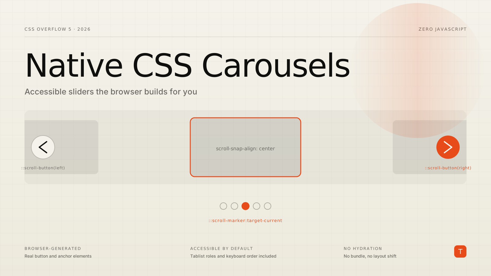
The carousel is one of the most requested — and most consistently botched — components on the web. Reach for a JavaScript library and you inherit a familiar list of costs: a bundle to download and parse, hydration that delays interactivity, layout shift while slides size themselves, and an accessibility implementation that is almost always subtly wrong. The WAI-ARIA carousel pattern is genuinely hard to get right, and most component libraries don't.
CSS now offers a different deal. The CSS Overflow Level 5 specification adds two pseudo-elements — ::scroll-button() and ::scroll-marker() — that let the browser generate the navigation buttons and dot indicators for a scroll container. Not divs you have to wire up, but real, interactive, correctly-labelled controls that the browser owns. Chrome and Edge shipped them in version 135, and they pair naturally with two features that landed in Interop 2026's focus list — Scroll Snap and scroll-driven animations. This post shows how to build a carousel with them, and how to deploy it responsibly given where browser support actually stands.
Why the JavaScript approach is expensive
A typical JS carousel does a lot of work the platform is better placed to do. It measures slide widths on load (a layout read that often triggers reflow), manages tabindex and aria-* attributes by hand, listens for keyboard events, and re-renders dot indicators as the active slide changes. Each of those is a place bugs hide. It also runs after hydration, which means the controls are inert during the exact window when a user is most likely to poke at them — and it contributes to Cumulative Layout Shift when slides pop into their final size.
The CSS approach inverts this. You declare a scroll container, tell the browser you want buttons and markers, and it produces them with the correct semantics before a single line of your JavaScript runs.
Start with a scroll container that works everywhere
The foundation is an ordinary scroll-snap container. This part is broadly supported across browsers and is itself an Interop 2026 focus area, so it is safe to ship today as your baseline:
.carousel {
  display: flex;
  overflow-x: auto;
  scroll-snap-type: x mandatory;
}

.carousel > li {
  flex: 0 0 100%;
  scroll-snap-align: center;
  scroll-snap-stop: always;
}
scroll-snap-stop: always forces the scroll to settle on one item at a time rather than flying past several — which matters once we add paging buttons. On its own, this is already a usable, touch-friendly, accessible slider. Everything that follows is enhancement layered on top.
Add navigation buttons with ::scroll-button()
A scroll button is generated by giving the pseudo-element a direction and some content. The browser inserts a real <button> as a sibling of the scroller, wires up the click behavior, and — importantly — automatically disables the button when the container can't scroll any further that way:
.carousel::scroll-button(left) {
  content: "\2190" / "Previous items";
}

.carousel::scroll-button(right) {
  content: "\2192" / "Next items";
}

.carousel::scroll-button(*):focus-visible {
  outline: 2px solid var(--accent);
  outline-offset: 4px;
}
Two details are worth calling out. The text after the slash in content is accessible label text — the string a screen reader announces — so the arrow glyph stays decorative while the control remains properly named. And ::scroll-button(*) is a convenience selector that targets every generated button at once, which is handy for shared focus and hover styles. Each press pages roughly 85% of the scroll container's length, so on a one-slide-per-view layout with snap points it advances a slide at a time; on a multi-item shelf it moves almost a full page. Logical-direction keywords (inline-start, inline-end, block-start, block-end) exist alongside the physical left/right/up/down forms if you want the controls to follow writing direction.
Add marker dots with ::scroll-marker()
Markers are the row of dots that show how many items exist and let a user jump directly to one. You opt in by declaring a scroll-marker-group on the container, then defining a ::scroll-marker for the items you want represented:
.carousel {
  /* places the generated marker container after the scroller */
  scroll-marker-group: after;
}

.carousel > li::scroll-marker {
  content: "";
  width: 12px;
  height: 12px;
  border-radius: 50%;
  border: 2px solid var(--accent);
}

.carousel > li::scroll-marker:target-current {
  background: var(--accent);
}
The browser creates each marker as a real anchor (<a>) element and collects them into a generated ::scroll-marker-group container that you can position wherever you like. The :target-current pseudo-class matches whichever marker corresponds to the item currently in view, so the "active dot" state is maintained for you — no scroll listener, no index tracking. Markers don't have to be dots: set content to text or a number and you get labelled tabs; the Chrome carousel gallery shows thumbnail markers for image galleries and chapter labels for long lists.
Accessibility you don't have to hand-write
This is the part that makes the feature more than a novelty. Because the browser generates the buttons and markers, it also owns their semantics. The marker group is exposed to assistive technology as a tablist, each marker behaves like a tab, and keyboard navigation follows the focusgroup model — arrow keys move between markers, and tab order is correct without a single tabindex. The scroll buttons are real buttons with real disabled states. You are getting the full accessibility tree that the ARIA carousel pattern asks for, implemented by the people who write the browser's accessibility engine rather than reconstructed by hand in application code.
Ship it safely: progressive enhancement
Here is the honest caveat. As of August 2026, ::scroll-button() and ::scroll-marker() are a Chromium feature — Chrome and Edge 135 and later — and are not yet Baseline. Safari and Firefox have not shipped them, and they are not on the Interop 2026 list (though the closely related Scroll Snap and scroll-driven animations are, which suggests the surrounding area is getting cross-browser attention). Treat the buttons and markers strictly as enhancement.
The structure above already does this correctly: the scroll-snap container is the baseline that every browser renders, and the generated controls simply don't appear where the pseudo-elements aren't understood. If you want to add styles or fallbacks conditionally, feature-detect with @supports and a selector test:
/* Fallback dots for browsers without ::scroll-marker */
.carousel-fallback-nav { display: flex; }

@supports selector(::scroll-marker) {
  .carousel-fallback-nav { display: none; }
}
That gives you a clean split: browsers that support the native markers hide your fallback and use the browser-generated ones; everyone else keeps a working scroll container plus whatever simple navigation you choose to provide. Nothing breaks, and Chromium users get the richer, accessible-by-default experience now. The performance win holds across the board — the baseline ships no carousel JavaScript at all, so there is no bundle to parse, no hydration delay, and no layout shift from client-side sizing.
Takeaways
Native CSS carousels are one of those rare features that improve accessibility, performance, and developer effort at the same time. To adopt them without risk:
- Build the scroll-snap container first. It works in every modern browser and is your permanent baseline, not a temporary shim.
- Layer
::scroll-button()and::scroll-marker()on top. They cost nothing where unsupported and disappear cleanly. - Let the browser own semantics. Don't add
tabindexor ARIA roles to the generated controls — the platform already provides the tablist and focusgroup behavior. - Feature-detect with
@supports selector(::scroll-marker)if you need a fallback navigation for Safari and Firefox today. - Delete JavaScript. For static or content-driven carousels, the pure-CSS version removes a whole class of hydration and layout-shift bugs. Reserve JS for genuinely dynamic needs like autoplay or infinite looping.
Start with the demos in the Chrome carousel configurator, ship the snap container everywhere, and let the native controls progressively enhance the browsers that support them.
Sources: Carousels with CSS on Chrome for Developers, the MDN references for ::scroll-marker and ::scroll-button, the CSS Overflow Level 5 spec, and Announcing Interop 2026 on WebKit.org.