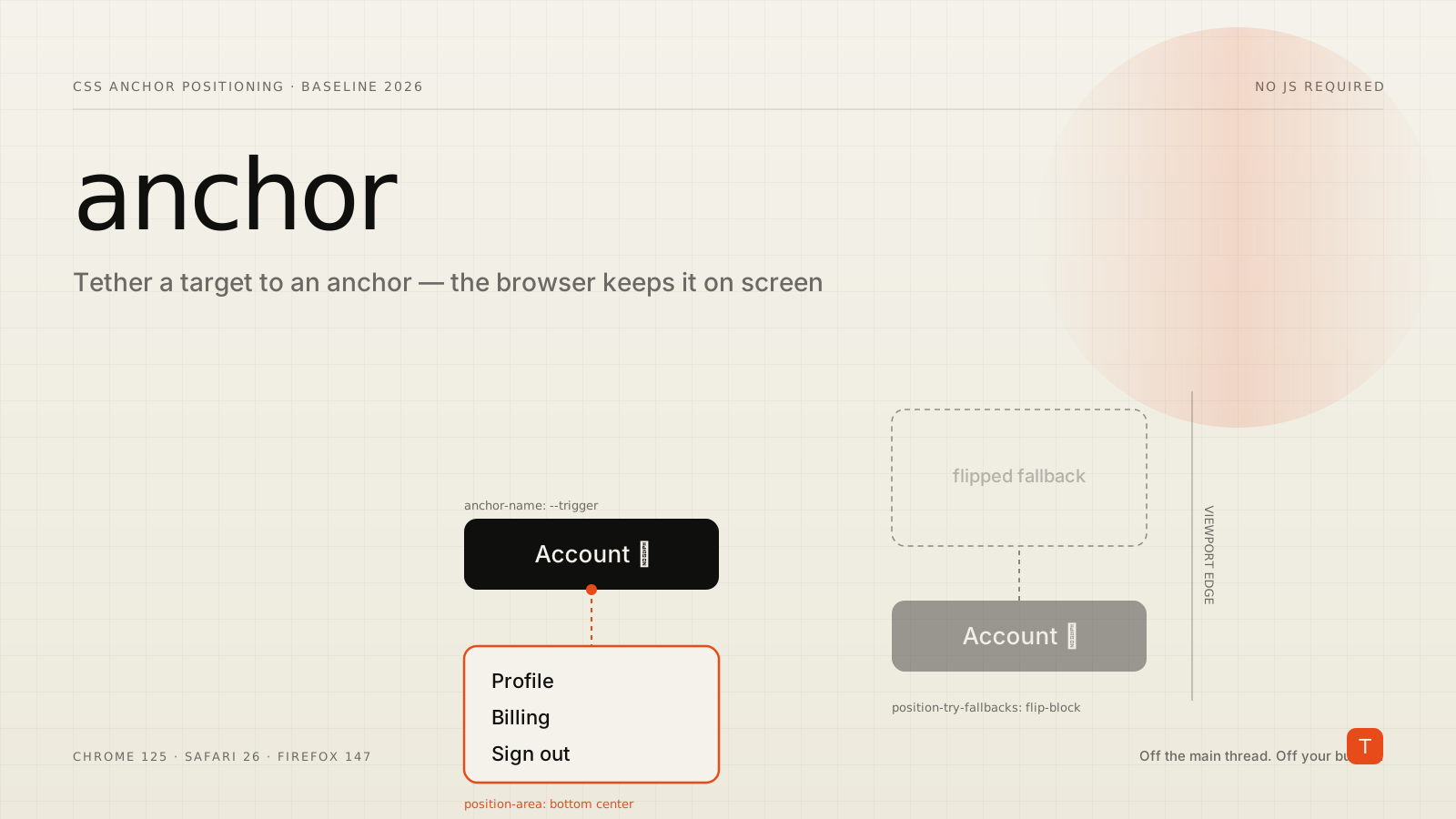
For years, "position this little box next to that button and keep it from falling off the screen" was a problem the web platform refused to solve. So the ecosystem solved it for itself, repeatedly: Popper, then Floating UI, then a dozen framework wrappers around them. Every dropdown, tooltip, combobox, and date picker in production today is very likely paying for a JavaScript library whose entire job is to read element rectangles, do some arithmetic, and write back top and left on every scroll and resize.
That whole category of code is now optional. CSS anchor positioning lets you tether one element to another declaratively, and the browser handles the geometry — including flipping the element to the other side when it would overflow the viewport. As of early 2026 it is interoperable everywhere: Firefox enabled it by default in Firefox 147 (released January 13, 2026), joining Chrome and Edge 125 and Safari 26, which gives the feature Baseline Newly available status (MDN: CSS anchor positioning). This is not behind a flag. It is the latest stable build of every major browser.
The two halves: an anchor and a target
The model has exactly two roles. One element is the anchor — the thing you position against, like a button. The other is the target — the absolutely-positioned element you want to place, like the menu that button opens.
You name an anchor with the anchor-name property, then point a target at it with position-anchor:
.menu-button {
  anchor-name: --menu-trigger;
}

.menu {
  position: fixed;
  position-anchor: --menu-trigger;
}
The anchor name is a dashed-ident, the same custom-property naming convention you already use for variables. With the association established, you place the target with position-area — a 3×3 grid centered on the anchor:
.menu {
  position: fixed;
  position-anchor: --menu-trigger;
  position-area: bottom center;
  margin-top: 8px;
}
position-area: bottom center reads exactly how it looks: put the menu directly below the button, horizontally centered. There is no getBoundingClientRect(), no scroll listener, no requestAnimationFrame loop keeping the two in sync. The browser ties them together and re-resolves the position itself.
For finer control than the nine-cell grid, the anchor() function returns the position of a specific edge of the anchor, usable inside top, left, inset, and friends:
.menu {
  position: fixed;
  /* Top edge of the menu sits on the bottom edge of the anchor */
  top: anchor(--menu-trigger bottom);
  /* Left edges aligned */
  left: anchor(--menu-trigger left);
}
The part libraries existed for: staying on screen
Naming and placement are convenient, but they are not why Floating UI has tens of millions of weekly downloads. The hard problem is collision handling — a tooltip anchored to the bottom of a button needs to flip to the top when the button is near the bottom of the viewport, or it gets clipped. That logic, tracked across scroll and resize, is the bulk of what those libraries actually do.
CSS does it with one property: position-try-fallbacks. You give it an ordered list of alternative placements, and the browser tries each until the target fits:
.tooltip {
  position: fixed;
  position-anchor: --trigger;
  position-area: bottom center;
  margin-top: 8px;
  /* If "bottom" overflows, flip to the top; then flip horizontally */
  position-try-fallbacks: flip-block, flip-inline;
}
flip-block mirrors the placement across the block axis (bottom becomes top), and flip-inline does the same on the inline axis (Chrome for Developers: the anchor positioning API). The browser evaluates them in order and picks the first that keeps the element visible. You can also define named fallback sets with @position-try for placements the keyword shortcuts don't cover. The behavior that used to require a runtime engine is now a declarative list the rendering engine resolves natively — no main-thread JavaScript involved.
A complete popover with zero script
Pair anchor positioning with the Popover API and the HTML popovertarget attribute, and an entire interactive menu ships without a line of JavaScript:
<button popovertarget="user-menu" class="menu-button">Account</button>

<div popover id="user-menu" class="menu">
  <a href="/profile">Profile</a>
  <a href="/billing">Billing</a>
  <a href="/logout">Sign out</a>
</div>
.menu-button { anchor-name: --user-trigger; }

.menu {
  position-anchor: --user-trigger;
  position-area: bottom span-left;
  margin-top: 6px;
  position-try-fallbacks: flip-block;
}
The button toggles the popover (open, close on outside click, Escape to dismiss, and top-layer rendering are all handled by the platform), and anchor positioning places it — flipping above the button when there isn't room below. Open, close, focus management, and positioning: all declarative.
Why this is a performance story, not just a convenience
Removing a positioning library is not only less code to write — it is less code to download, parse, and run on the main thread. Floating UI and its peers ship in the tens of kilobytes once you include the middleware most apps use, and that JavaScript executes during exactly the moments users are interacting: opening a menu, hovering a tooltip, focusing a field. That is INP territory — the Interaction to Next Paint metric that has been a Core Web Vital since 2024. Positioning math running in a scroll or resize handler is a textbook source of long tasks that delay the next paint.
Anchor positioning moves that work into the browser's compositor and layout engine, off the JavaScript main thread entirely. The scroll-linked repositioning that used to fire a JS callback on every frame is now native. For an app with dozens of anchored elements, deleting that library trims bundle size, removes a hydration cost, and quietly improves interaction responsiveness — three wins from one platform feature.
Shipping it without breaking older browsers
Baseline Newly available means current browsers support it, but a meaningful slice of real traffic — especially mobile devices a version or two behind — does not yet. Anchor positioning should therefore be a progressive enhancement layered over a placement that is at least usable without it.
The cleanest approach is to keep a static fallback position and gate the anchored version behind @supports:
.tooltip {
  position: fixed;
  bottom: 1rem; /* a sane default location for old browsers */
  left: 1rem;
}

@supports (anchor-name: --x) {
  .tooltip {
    position-anchor: --trigger;
    position-area: bottom center;
    inset: auto; /* clear the fallback offsets */
    position-try-fallbacks: flip-block, flip-inline;
  }
}
Browsers that understand anchoring get the smart, collision-aware placement; everything else gets a fixed position that, while not tethered, is still on screen and functional. For components where exact tethering is essential on every browser today — a complex combobox, say — it is reasonable to keep the JavaScript library for now and adopt anchor positioning for the lower-risk surfaces (tooltips, simple dropdowns, hint popovers) first.
Takeaways
CSS anchor positioning closes one of the longest-standing gaps between what designers asked for and what the platform offered. It became Baseline in early 2026, so it is a real option for production work this quarter, not a future bet.
If you are adopting it, start by auditing where you currently load a positioning library and which of those usages are simple: tooltips, hint bubbles, and basic menus are the fastest wins. Rebuild those with anchor-name, position-anchor, and position-area, add position-try-fallbacks so they stay on screen, and combine them with the Popover API to delete the open/close JavaScript too. Wrap each migration in an @supports (anchor-name: --x) guard with a static fallback so older browsers degrade predictably. The payoff is concrete and measurable: a smaller bundle, less main-thread work during interactions, and one fewer dependency your team has to keep patched.