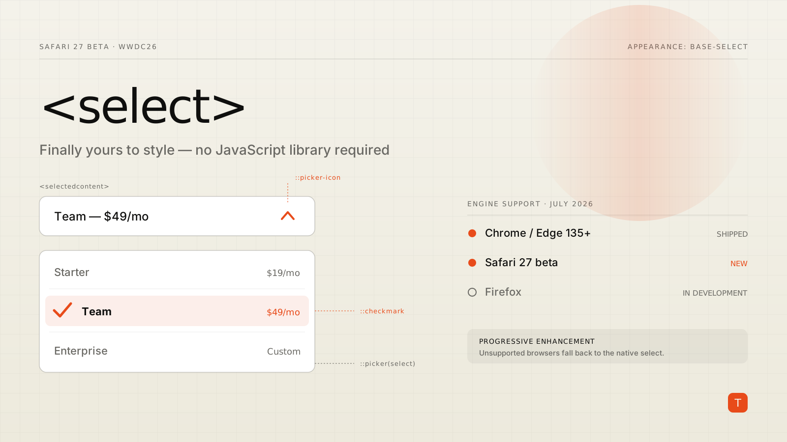
For as long as the web has had forms, <select> has been the control teams give up on. You can change its font and border, but the button's internals and the dropdown itself belonged to the operating system. So every design system eventually ships a CustomSelect component — a <div>-and-JavaScript reconstruction that has to reimplement keyboard navigation, focus management, ARIA semantics, form submission, and mobile behavior from scratch. Most get at least one of those wrong.
That era is ending. At WWDC26 in June, Apple announced Safari 27 beta, and among its 58 new features is the one form-heavy teams have been waiting for: customizable <select>. Chrome and Edge shipped the same capability in version 135 back in March 2025. With WebKit on board, styleable native dropdowns now cover two of the three major engines — and the syntax is designed so you can adopt it today without breaking anyone.
What you actually get
Customizable <select> is an opt-in. One CSS declaration switches the element from OS-rendered widget to a plain, styleable box model:
select,
select::picker(select) {
  appearance: base-select;
}
The first selector opts in the in-page button; the ::picker(select) pseudo-element opts in the dropdown itself. From there, it's just CSS. The API surface is small but covers the parts you've always wanted to reach:
::picker(select)— the popup containing the options. Style its background, border, shadow, padding; animate it opening and closing.::picker-icon— the disclosure arrow inside the button. Replace it, recolor it, rotate it when the select is open.::checkmark— the indicator next to the currently selected<option>in the list.<selectedcontent>— a new element you place inside the select's button that mirrors the selected option's content, so the closed state can show exactly what you want.:open— a pseudo-class on the<select>that matches while the picker is showing (it reached Baseline earlier this year).
Crucially, you can now put real markup inside <option> — images, spans, styled price tags — and it renders. The country picker with flag icons no longer needs a library.
A complete example
Here's a compact but realistic custom select — styled button, rich options, and an animated dropdown:
<select class="plan-picker">
  <button>
    <selectedcontent></selectedcontent>
  </button>
  <option value="starter">
    <span class="name">Starter</span>
    <span class="price">$19/mo</span>
  </option>
  <option value="team">
    <span class="name">Team</span>
    <span class="price">$49/mo</span>
  </option>
</select>
.plan-picker,
.plan-picker::picker(select) {
  appearance: base-select;
}

/* The closed button */
.plan-picker {
  border: 1px solid #d0cdc2;
  border-radius: 8px;
  padding: 0.5rem 0.75rem;
  background: #fff;
}

/* Rotate the arrow while open */
.plan-picker::picker-icon {
  transition: rotate 0.2s;
}
.plan-picker:open::picker-icon {
  rotate: 180deg;
}

/* The dropdown */
.plan-picker::picker(select) {
  border: 1px solid #d0cdc2;
  border-radius: 8px;
  box-shadow: 0 8px 24px rgb(0 0 0 / 0.12);
  transition: opacity 0.2s, transform 0.2s,
    display 0.2s allow-discrete, overlay 0.2s allow-discrete;
}

/* Enter/exit animation */
.plan-picker::picker(select) {
  opacity: 1;
  transform: translateY(0);
}
.plan-picker:not(:open)::picker(select) {
  opacity: 0;
  transform: translateY(-8px);
}
@starting-style {
  .plan-picker:open::picker(select) {
    opacity: 0;
    transform: translateY(-8px);
  }
}

/* Options */
.plan-picker option {
  display: flex;
  justify-content: space-between;
  gap: 2rem;
  padding: 0.5rem 0.75rem;
}
.plan-picker option:checked {
  font-weight: 600;
}
The <button> wrapping <selectedcontent> is optional — omit it and the browser renders a default button — but including it gives you full control of the closed state. Note the allow-discrete transitions: the picker is built on the same popover machinery as [popover], so display and overlay animate the way you'd animate a popover.
The part that matters: you keep the native behavior
The whole point of this feature — and the reason Open UI spent years on it rather than blessing a div pattern — is what you don't have to rebuild. As the WebKit team puts it, you're still working with a real <select>: keyboard navigation, screen reader support, form submission, validation, and change events all keep working exactly as before. Touch devices get proper platform behavior. Autofill works. Your form library doesn't notice anything changed.
Compare that to the typical custom dropdown component, which is a permanent maintenance liability: every accessibility audit finds something, every framework migration means porting it, and every mobile Safari update is a small gamble.
WebKit's release also includes a batch of <select> fixes that matter at scale — among them a performance fix for parsing selects with thousands of <option> children via innerHTML (previously O(n²)) and correct picker placement when the <select> is anchor-positioned.
Adoption strategy: progressive enhancement, no risk
The syntax was deliberately designed to be safe to ship today. Browsers that don't understand appearance: base-select ignore it and render their built-in select. Content inside <option> that old engines can't render degrades to its text. <selectedcontent> is simply inert where unsupported. There is no JavaScript feature-detection dance — the CSS is the feature detection.
That leaves the support matrix looking like this as of July 2026:
- Chrome / Edge 135+ — shipped, stable since March 2025.
- Safari 27 beta — shipped in the beta now; stable expected with the fall 2026 OS releases.
- Firefox — not yet shipped; implementation is tracked in Bugzilla #1944403, and Mozilla has separately flagged
appearance: base-selectfor Baseline alignment.
In other words: a large majority of your users get the custom design, everyone else gets a perfectly functional native select, and no one gets a broken form. That's a much better failure mode than a JavaScript dropdown that breaks for everyone when something goes wrong.
Practical takeaways
If you maintain a design system or a form-heavy product, this is worth acting on now rather than watching from a distance. Start by opting in one low-risk select — a settings page, a locale picker — with appearance: base-select behind your normal CSS, and keep the default rendering as your fallback. Audit your existing custom dropdown components and note which exist purely for styling; those are candidates for deletion once Safari 27 goes stable this fall. And if you're writing a new component today, write it as a real <select> styled with this API, not another div reimplementation — you'll ship less JavaScript, pass accessibility review by default, and delete nothing later.
The dropdown library had a good twenty-year run. It's fine to let it retire.
Sources: WebKit: News from WWDC26 — WebKit in Safari 27 beta · Chrome for Developers: The select element can now be customized with CSS · MDN: Customizable select elements